Introduction
In the ever-evolving landscape of enterprise architecture, effective communication is paramount. ArchiMate 3, with its versatile notation system, provides architects with a powerful tool to express complex models. This guide delves into the nuances of ArchiMate 3, exploring concepts such as nesting, color usage, and notational cues. Whether you are a seasoned architect or just beginning your journey, understanding these elements will enhance your ability to create meaningful and comprehensible architecture models.
Nesting, Colors, and Notation Cues
ArchiMate 3 introduces some interesting concepts to help express architecture models in a way that is both standardized and flexible.

- Nesting is one such concept, where elements can be placed inside other elements to represent relationships. This provides an alternative graphical notation to express certain relationships, adding a layer of visual complexity and detail to the architecture diagrams.
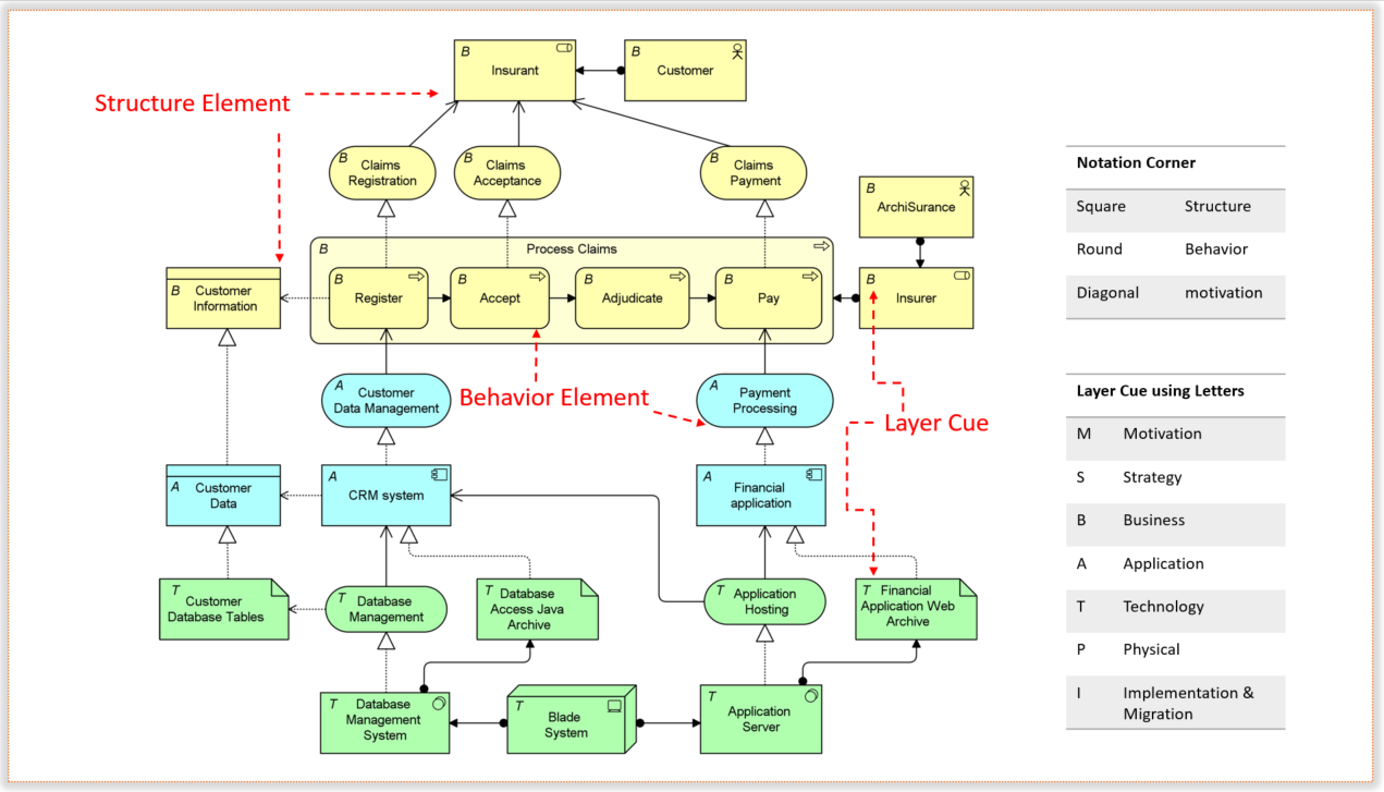
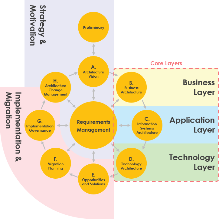
- The use of colors and notational cues is another important aspect. While the ArchiMate standard provides a common graphical notation with shades of grey to distinguish between different aspects of the framework (abstract concepts, passive structures, behavior, and active structures), it also allows for flexibility in color usage. In example models, colors like yellow, blue, and green are used to distinguish between different layers of the ArchiMate Core Framework (Business Layer, Application Layer, and Technology Layer). This not only adds visual appeal but can also convey additional information or emphasize specific aspects of the model.

architecture layers are often represented using different colors to provide visual distinction and aid in understanding. While ArchiMate itself does not prescribe specific colors for layers, it allows for flexibility in color usage based on the preferences of the modeler.For example, in many ArchiMate models, a convention is followed where different layers are assigned specific colors for clarity and emphasis:
- Yellow for the Business Layer
- Blue for the Application Layer
- Green for the Technology Layer
- The letter convention in the top-left corner of an element adds yet another layer of notational cues. Using letters like M, S, B, A, T, P, or I can quickly denote the type of element (Motivation, Strategy, Business, Application, Technology, Physical, or Implementation & Migration). This helps in quickly identifying and categorizing elements within the architecture model.
The standard notation’s use of different corner shapes for different element types is a clever way to visually distinguish between structure elements, behavior elements, and motivation elements. Square corners, round corners, and diagonal corners serve as visual cues, making it easier for stakeholders to understand the nature of each element at a glance.
All these features contribute to making ArchiMate 3 a powerful language for expressing and communicating complex architecture models in a way that is both standardized and adaptable to the needs of different stakeholders.
Summary
“Visualizing Architectural Complexity” offers a comprehensive exploration of ArchiMate 3, focusing on its unique features and notation techniques. The guide introduces the concept of nesting, providing alternative graphical notations for expressing intricate relationships within architecture models. It also delves into the creative use of colors and notational cues, allowing architects the flexibility to tailor their visualizations to different stakeholders. With practical insights and examples, this guide equips architects with the knowledge to leverage ArchiMate 3 effectively, facilitating clear and impactful communication in the world of enterprise architecture.